
The installation of a museum in our campus was a dream of our former Director, Mrs. Meenakshi Balakrishnan, fondly referred to as ‘Mother’. Her daughter, our present Director, Mrs. Deepa Sridhar, turned this into a reality in the summer of 2022.
The museum brings to fore the legacy of values and traditions held dear to the heart of every Kumaranite. It has a variety of innovative displays celebrating our institution's evolution and eminence.
The area, which has been artfully transformed by interior designers, Studio Ruh, includes display panels that showcase memorabilia, a creative display of our core values, a scaled-down model of the breath-taking campuses, notes from the heads of our five institutions and, murals of our Founder Mother and Mother created by mural artist, Madhu Chandrika.
The museum showcases the 64 years journey of our school, highlighting our students, staff and alumni, celebrating the verdant, open spaces of our campuses and the light and laughter that fill it.
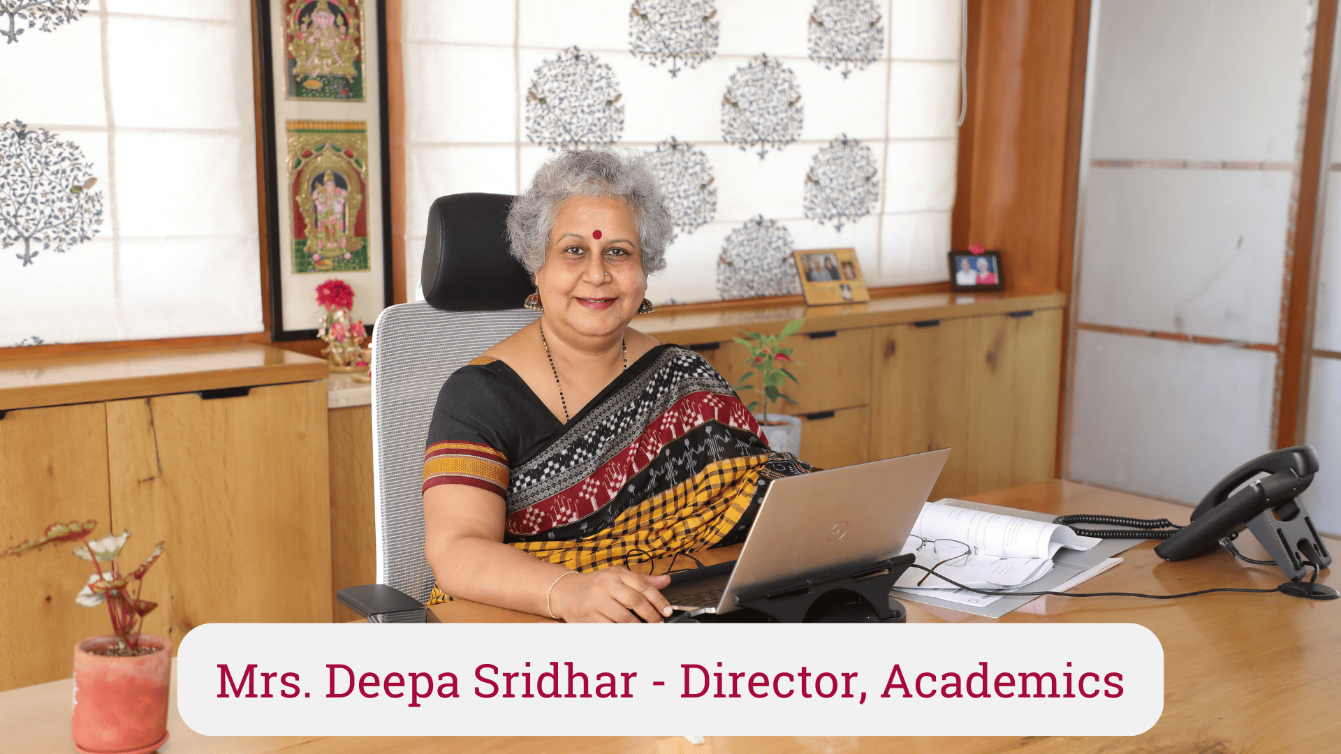
A school museum is an innovative way of showcasing the journey of an Institution. The museum exhibits the grand legacy of the Kumaran Group of Institutions. This thoughtfully designed space is a fine tribute to the Founder Mother and Mother. There is something to cherish for every Kumaranite in this well designed space. Every corner has a story to tell. To understand the concept better, students of the magazine team interviewed the Director, Mrs. Deepa Sridhar who visualized this exclusive,must visit space in the school. Here is an excerpt of the interview :
Deepa Ma’am. The inspiration for this museum had been present 15 years back and this space was created for the same, but it was only this year that we were able to put it together completely. The museum showcases the 63 year journey of our school by highlighting our students, staff and alumni.
Deepa Ma’am. My favourite corner of the museum is the student value board. When a survey was conducted to bring forward these values, ten common ones were found across all our schools, this board accentuates these values and virtues which are ingrained in Kumaranites”
Deepa Ma’am. The 3 phrases that describe the museum would be - The perseverance of our founder mother, a representation of our legacy with a window of opportunity to know more about the school, and finally, an insight into the school for prospective parents.
Deepa Ma’am. We have used natural, earthy materials in order to match the overall profile of our school. These include coir for the board, bamboo for the false ceiling etc. Collectively, it was very eco-friendly in nature.
Deepa Ma’am. We chose muted and subtle colours like beige and cream throughout the museum. Apart from these, green was a colour we consciously chose to connect with the spaces outside including the courtyards and trees. We also placed arched doors to give a more open and airy feel while keeping with the general architecture of our school building.
Deepa Ma’am. The main takeaway of the museum is ‘a glimpse into the past and into the future.’
Deepa Ma’am. It was a very different and invigorating experience to work with architects who provided fresh perspective to our designs. I was also awestruck by the professionalism and the punctuality with which they worked.
Deepa Ma’am. According to me, the murals of our founder mother and our former director, the board of values and virtues of our school along with what it stands for, and a miniature replica of our campuses are the major highlights of the museum.
Deepa Ma’am. We plan on displaying the art and literary works along with photographs taken by our children. We also wish to capture the life of a Kumaranite on a digital platform. The museum, in addition to this, will be used to showcase the alumni across our schools by alternating displays of news, events etc. every 3 months.
Deepa Ma’am. The museum was foremost, the vision of our former director. Unfortunately, she isn't here with us to witness our accomplishment, however she would have been very happy to see it. Our founding mother on the other hand, would have never thought that she was creating such a legacy while she laid down the roots but our former director who witnessed the growth and rise of our school and its potential would have definitely envisaged such a marvellous feat after seeing the school flourish and reach the height it has today.
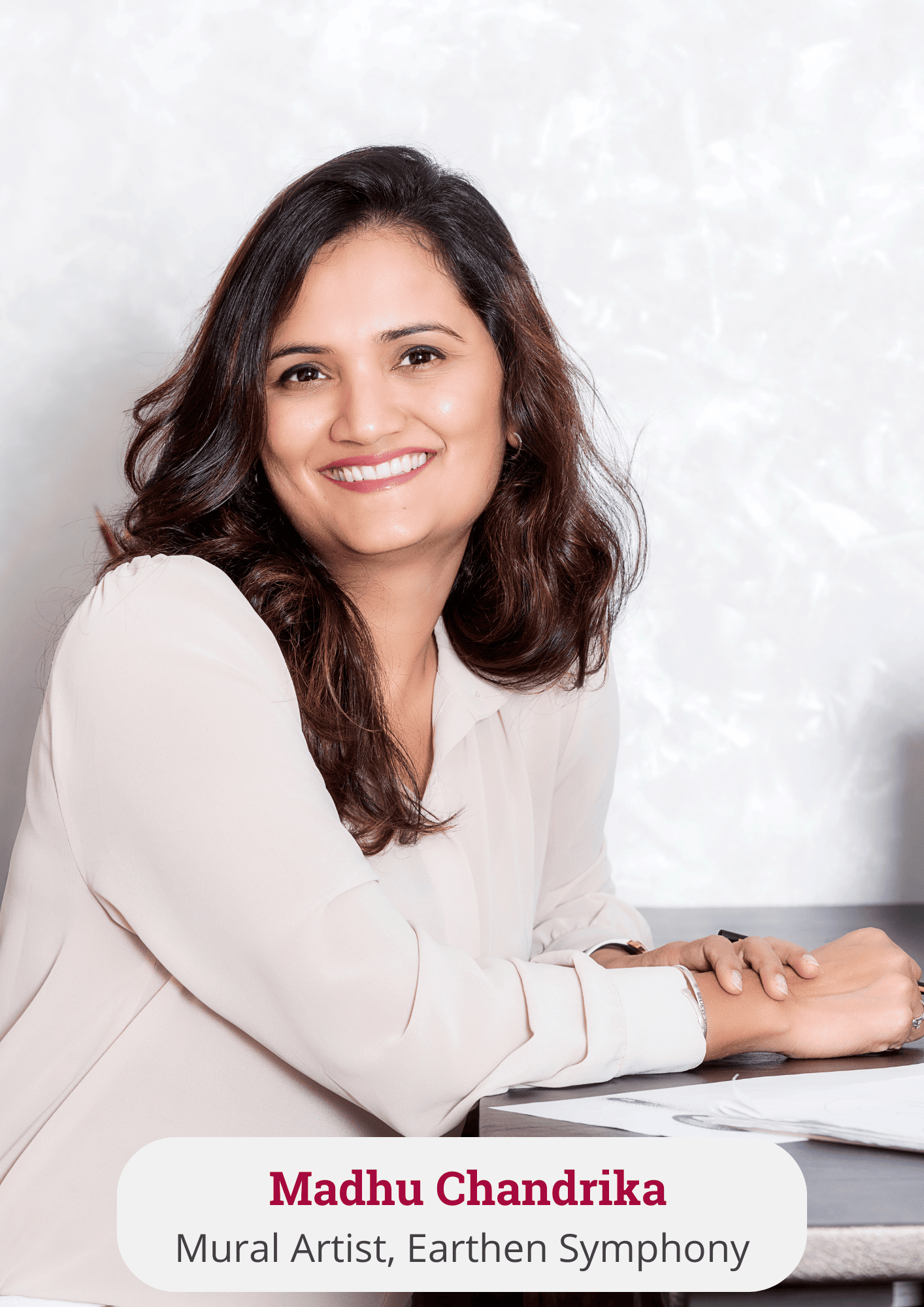
Madhu: While all the values and beliefs are inspiring, I resonated most with “Harmony through harnessing the best in every individual in the school community,” Because I see this as being critical in giving space to every child to bloom to their own full potential and being their own competition rather than being measured by a uniform yardstick.
Madhu: This artwork is inspired by the line “lead kindly light" in the school logo. I sketched the artwork as a visual metaphor for the school vision which says “Our vision for the school is to be an excellent academy of global choice, emphasize upon Indian values, culture and provide opportunities for the holistic development of every child to face the challenges of a changing world.” When you see the detailing close-up, you will see that it is inspired by the intricacy in Indian art forms, but presented in a global design language.
Madhu: This artwork is a kinetic installation. The lives of the founder mother Smt. R Anasuya Devi and former director Smt. Meenakshi Balakrishnan are so inspiring and spirited! I wanted to capture that spirit while making a portrait, and like you rightly mentioned wanted to get away from the usual depictions. The kinetic installation where the discs flutter with the subtlest of movement gives the viewer an “ aha! “ moment, when they recognise the face from a certain distance and as they come close they see the different colours in the tiny circles which take prominence. Another point was also the location itself, the angled walls lent themselves so beautifully to position both the portraits as if in conversation, bringing the space alive with their presence.
Madhu: This space is a waiting area and people in the space have time to linger on the artwork and absorb more than just a glance if you were to walk by. Hence I choose to do a narrative artwork which tells the story of the varied activities that a child indulges in at Sri Kumaran School. In the artwork the background is made like a set of building blocks and the activities depicted flow and overlap from one to the other and are not confined to a single box depicting the holistic development of the child that the school focuses on. I chose a bright and colourful palette which adds a liveliness to the sunlight filled room.
Madhu: I had a great experience working with Madam Deepa and the architect Kavya from studio RUH. Madam Deepa was very precise in her brief, and this helped immensely while ideating. My work is to give a visual to the brief and the content. I work as a team with the client to bring out what the space dictates.
Madhu: The materials are a mix of Aluminium, wood and resins.
Madhu: Follow your passion and give in more than 100% in everything you do so that you don’t have to look back later and wish you had done just that little more! If you take care of this, the rest will be taken care of for you!
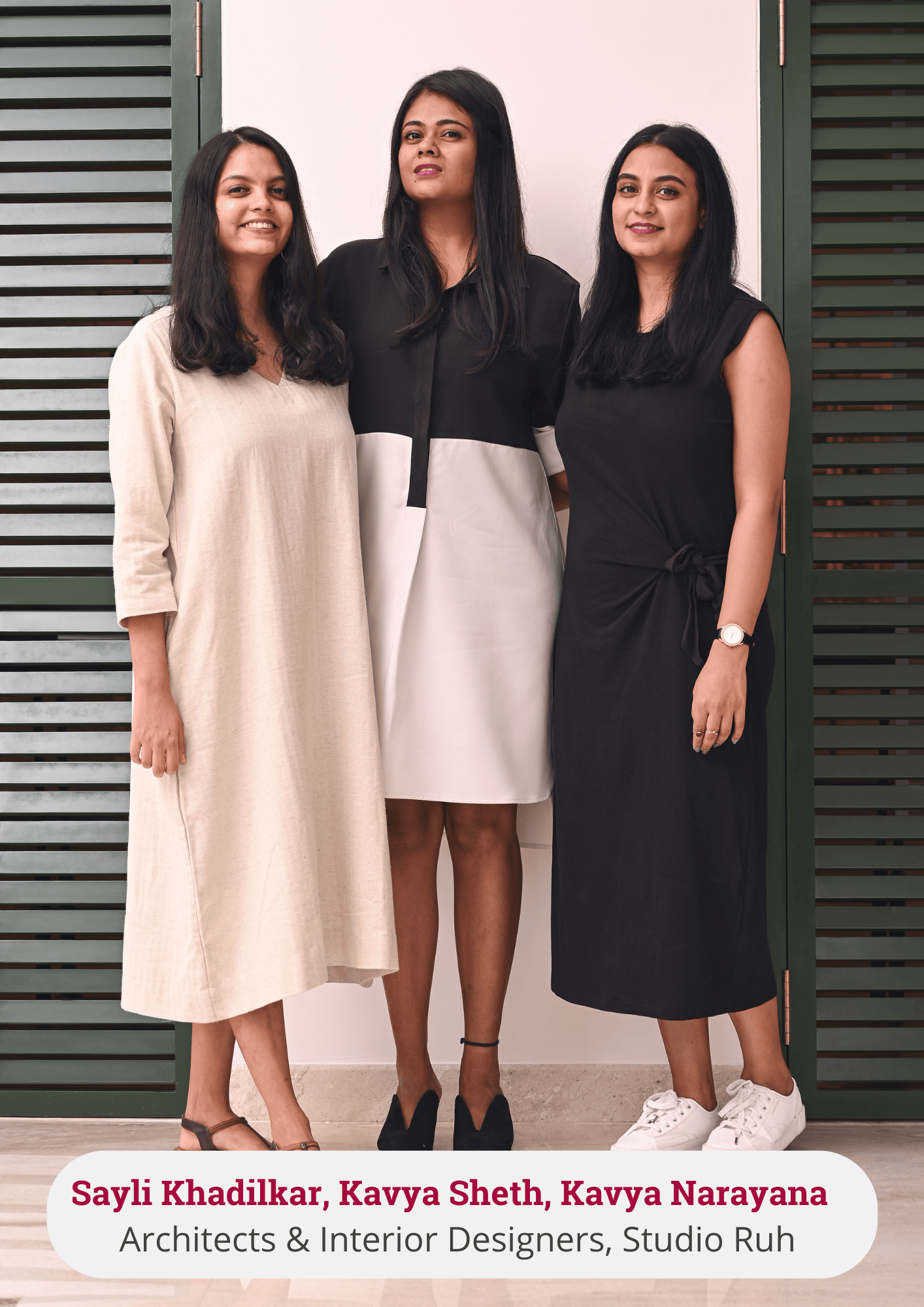
Sayli Khadilkar: We drew inspiration from the beautiful and scenic school campus, the culture and traditions of the school, and the natural materials and elements that encompass the campus. We wanted to curate a space that captured the very essence and ethos of the school.
Kavya Sheth: This project was very different as the subjects of the museum were a wide array of people, and so were the audience that would visit. We took a step back to not only understand the past, but also study the present and tie it to what could be a transformed future. The design had to be universal and adaptive but also very rooted - for which we’ve adopted an earthy and natural palette. We especially love the banana fibre on the ceiling and the use of cloth and recycled paper as a display!
Sayli Khadilkar:The design process involved about four months of diverse conversations with our client, Mrs. Deepa Sridhar, and her whole team, numerous site visits, concept discussions, and experiments with textures & materials. These conversations were carefully curated and translated into design nuances which were then manifested on-site.
Kavya Sheth: We’ve learnt so much about the rich heritage, culture and values of Sri Kumaran as a school. We feel immensely proud to be associated with an institution that values people above all else. The design process has taught us to be respectful of an institute’s history, and approach design holistically- via different mediums. We engaged architectural photographers, model makers, mural artists, clay artists, graphic designers and so many other handymen to achieve this space. We cherish the journey we’ve had and are excited for everyone else to experience the space.
Kavya Narayana: It’s hard to pick a favourite part, as each and every corner tells a story, making this entire experience immersive and educational.
Kavya Sheth: We were fortunate to have a client who was very open to fresh ideas, materials and concepts. This made the journey very engaging and enjoyable for us as designers. We were aligned in terms of the design aesthetics and experience that we were trying to create right from the beginning. The only challenge that we faced, if any, was that the site we were given had a low false ceiling and no natural light. We combatted these limitations by opening up the whole ceiling and bringing back natural height and volume. For the light, we punctured cavities in the wall to create these beautiful louvered doors that bring in so much light and life into the space. It enables visitor engagement and arouses curiosity in one’s mind right from the entrance to the admin block.
Kavya Narayana: Three words I would use to describe the museum are History, Journey and Experience.
Sayli Khadilkar: The design of the space is an outcome of the various processes at different stages. The initial stage involved the site recce, understanding the project brief, the target audience, and studying the various aspects of the school - the strong legacy, leadership, culture & traditions. We documented this information and translated the same onto our drawing boards. We then worked on conceptual sketches, derived zoning & circulation of the space. The tangible and intangible elements were translated into display components. We worked on 2D and 3D design iterations, experimented with different colours, materials and textures for the space, and collaborated & coordinated with various artists, vendors, designers and the site team to achieve the desired outcome. We are really excited to see it come to life!
Kavya Sheth: We paid key attention to ensure the museum evolves with the evolution of all schools/colleges under the Kumaran umbrella. All the display units are designed to be adaptive, with graphics that are changeable with the passage of time.
Kavya Narayana: My advice would be to “Go for it.” Design has helped me grow as an individual, by making me look at things with a new perspective, by expanding my ability to think outside the box and solve problems. I would encourage everyone to find their niche and pursue that path with confidence.